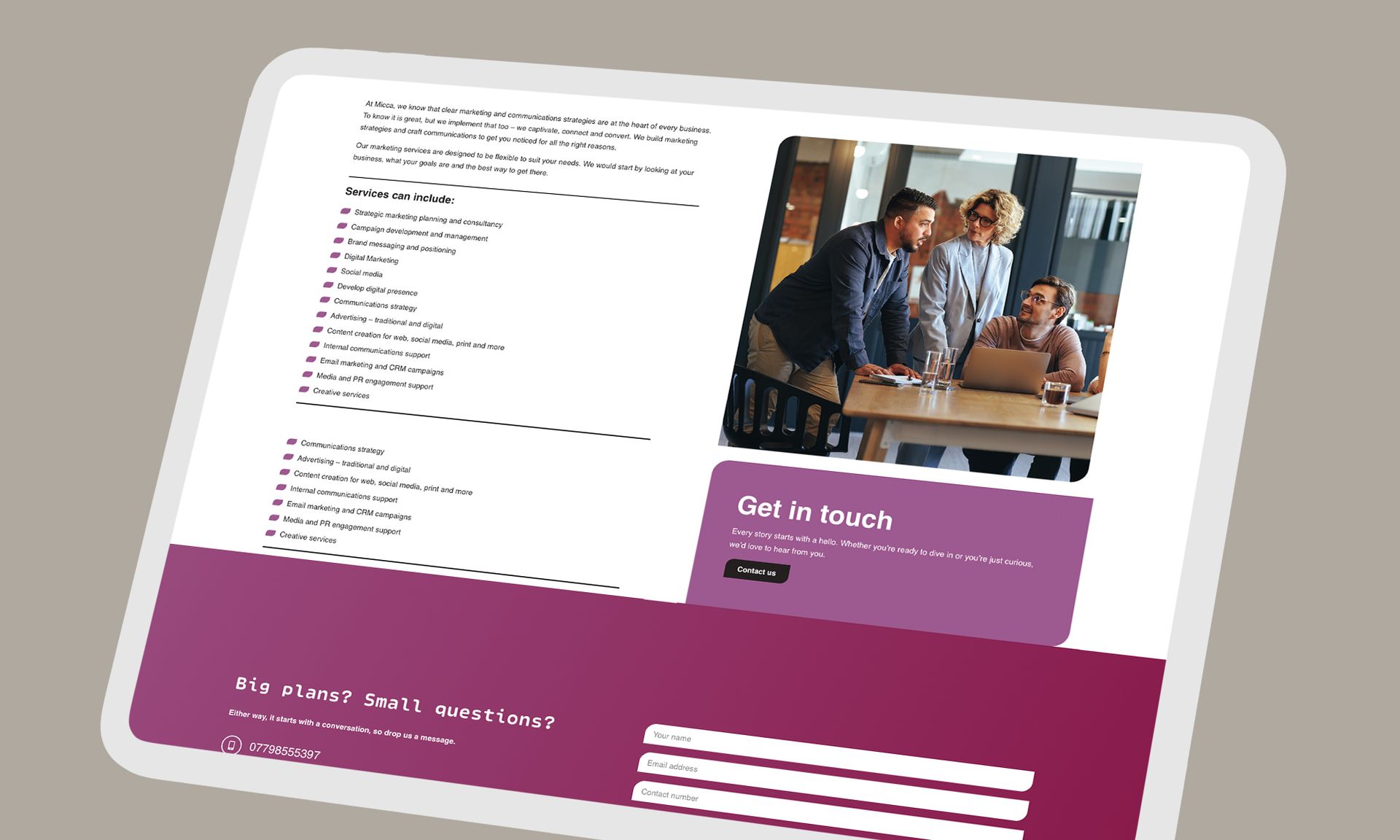

The pages every small business website should have

John Hill • July 26, 2026

For many small businesses, a website is much more than an online brochure. It is often the first impression potential customers have of your business and can play a big part in whether they decide to get in touch.


Whether someone has found you through Google, social media or a recommendation, your website should quickly answer a few simple questions. Who are you? What do you do? Why should they choose you? And how can they contact you?


Every business is different, but there are a few pages that almost every small business website should include. Together, they help build trust, answer common questions and make it easier for visitors to become customers.

Home

Your homepage is the front door to your website. Within a few seconds, visitors should understand what your business offers and who it is for.


Keep your messaging simple and clear. Explain what you do, highlight the value you provide and make it obvious what visitors should do next, whether that's getting in touch, requesting a quote or exploring your services.


Rather than trying to squeeze everything onto one page, think of your homepage as a starting point that guides people to the information they need.

About

People like doing business with people, which is why your About page is often one of the most visited pages on a website.


This is your opportunity to introduce yourself, explain how your business started and share what makes you different. You do not need to tell your entire life story. Instead, focus on what you enjoy about your work, the experience you bring and how you help your customers.


Adding a friendly photo of yourself or your team can also help visitors feel more connected to your business.

Services or products

This page should clearly explain what you offer and how it benefits your customers.


Try to avoid simply listing features. Instead, describe the problems you solve and the outcomes your customers can expect. Writing in plain English makes your services easier to understand and helps visitors quickly decide whether you are the right fit.


If you offer several services, consider giving each one its own page. This not only makes your website easier to navigate but can also improve your visibility in search engines by allowing each service to target relevant search terms.

Testimonials or case studies

One of the easiest ways to build trust is by showing how you have helped previous customers.


Testimonials, reviews and case studies give potential customers confidence that they are making the right decision. Wherever possible, include genuine feedback and explain the results you achieved.


Real examples often speak louder than any sales message.

Contact

If someone is ready to get in touch, make it as easy as possible.


Your contact page should include everything a visitor needs, such as:

  • A contact form
  • Your email address
  • A telephone number, if appropriate
  • Your business location or the areas you serve
  • Opening hours, where relevant


The fewer barriers there are, the more likely someone is to contact you.

Frequently asked questions

An FAQ page is often overlooked, but it can be incredibly useful.


Think about the questions customers ask before they choose to work with you and answer them clearly. This can save you time, help visitors feel more confident and provide useful information for search engines.


It also shows that you understand your customers and the concerns they may have.

Legal information

Every business website should include the appropriate legal information.


Depending on your business, this may include:


  • A privacy policy
  • A cookie policy
  • Terms and conditions
  • An accessibility statement


These pages help demonstrate professionalism and ensure your website meets its legal responsibilities.

Quality matters more than quantity

A successful website is not measured by how many pages it has. It is measured by how well those pages help your visitors.


If your website clearly explains what you do, builds trust and makes it easy for people to contact you, you are already creating a better experience for potential customers.


If you have not reviewed your website for a while, now is a great time to check whether these essential pages are in place. Even a few small improvements can make a big difference to how your website performs and how visitors experience your business.

By John Hill June 6, 2025
Over the past few months, I've had the opportunity to work on a variety of exciting web projects for new and returning clients. From full-scale website launches to ongoing consultancy and UX refinement, it's been a busy and fulfilling time. In this blog, I’ll share some of the highlights, including new client partnerships, website launches, and projects currently in progress. If you're curious about what I’ve been up to or you’re thinking about starting your own project — read on. New client welcomes It’s always great to welcome new clients onboard, and in the last few months I’ve had the pleasure of beginning work with several organisations across different sectors. Here’s a quick introduction to them and what we’re working on together. SurreyFE is a collaboration between further education providers in Surrey — including Brooklands Technical College, East Surrey College, Nescot, and Activate Learning — with the aim of raising the profile of vocational and technical education in the region. I was brought in to help establish their digital presence, including a completely new website designed to be clear, accessible, and engaging. The Complete Education Solution. This education-focused organisation provides flexible learning solutions, including the National Online School. I’m currently working with their team on a major rebuild of their National Online School. The goal is to create a modern, intuitive, and scalable platform that better reflects their unique offering in the online learning space. Micca Marketing is a growing marketing agency offering tailored campaigns for small to mid-sized businesses. They approached me to create a clean, modern website that reflects their brand values and clearly communicates their services. Website launches Over the past few months I’ve launched a couple of new websites that I’m really proud of. SurreyFE The SurreyFE site went live last month. It features streamlined navigation, clear messaging, and a responsive layout that works beautifully across devices. The design represents the collaborative, future-focused nature of SurreyFE and is a launchpad for events, updates, and everything else the organisation wants to shout about. You can visit the website here Micca Marketing I also launched the new Micca Marketing website recently. This was a fast-paced build with close collaboration from their team. The result is a fresh, bold design that supports their growing brand and provides a solid foundation for future growth. You can visit the website here Projects in progress Here’s a look at a few of the projects I’m currently working on, including a complete redesign of a website and working with existing clients to improve their current websites. National Online School Website (The Complete Education Solution) Work is well underway on the rebuild of the National Online School platform. We've just finalised the visuals, and the project has now moved into development. I've just started building the full website! A major focus is on streamlining user journeys for parents and learners, while making the back end easier to manage for staff in house. I am working with the team at TCES to achieve launching the website at the end of June! ProcureCo ProcureCo is a professional procurement platform. I've been working with the team at ProcureCo since the start of the year assisting them with a website refresh, focusing on modernising the look and feel, improving the structure of their service pages, and sharpening up their calls to action. We've redesigned a number of key pages so far and I'm currently working with them on a new Hub for their website users and a suite of how-to guides. To see what I've done so far have a look here . REAL Transfers REAL Transfers, a luxury chauffeur company based in London, is working with me to enhance their website UX and conversion performance. We’re looking at page structure, mobile usability, and improving how services are communicated — especially for high-value journeys like airport and cruise transfers. I've been restructuring parts of the website by creating pillar pages and more detailed service pages to aid the user journey and improve the visibility of the booking page. You can browse the REAL site here From launching new websites for SurreyFE and Micca Marketing to progressing major builds like the National Online School, it’s been a productive and rewarding start to the year. So that's a wrap on the first few months of the year! Thinking about a website project? Whether you're launching something new or thinking about improving what you already have, I’d love to chat. Drop me a message if you want to talk through an idea, get an outside perspective on your site, or just see what’s possible. 
By John Hill March 1, 2025
Web design is constantly evolving, and staying ahead of trends means staying competitive — and spending more time developing and improving your website. Each year brings fresh ideas and approaches that inspire smarter, more engaging design. But do you really need to worry about them? Here are some of the biggest design shifts I’m seeing — and how you can take advantage of them. And yes... I mention AI. 1. Motion with meaning Micro-animations and scroll-based interactions are no longer just for flashy, high-end New York design agencies or those conceptual websites that look amazing but don’t explain what they do. We're now seeing more websites using motion to enhance storytelling and guide user attention — something that's become huge on social media, too. Whether it’s a button animation that reinforces a click or a subtle scroll effect that draws the eye, purposeful motion adds life to a design. In 2025, expect to see more websites using animation to improve UX — not just for aesthetics, but to clarify actions and smooth transitions. It’s something I’ve integrated into my own website, and I love bringing it into client builds. But, like any aesthetic decision, make sure animation doesn’t drag down loading speed. Function over style! 2. AI-assisted personalisation Yes, the dreaded AI... I’ll save my full thoughts on AI for another blog, but there’s no denying it’s influencing how websites work. Expect more tailored content and layouts based on user behavior, powered by advances in AI and machine learning. Dynamic content blocks, predictive product suggestions, and even chatbots are becoming more human-like (even if I still find myself hammering “speak to a human” when I encounter one!). Personalisation helps increase engagement and conversion by making users feel like the experience was designed just for them. The best part? Businesses of all sizes can now integrate these tools without a huge budget. 3. Bold minimalism Designers are embracing whitespace (something I’ve always been a fan of), strong typography, and limited color palettes to create clean, focused experiences. Minimalism doesn’t mean boring — it means intentional, with every element earning its place on the page. The goal is to reduce cognitive load and make websites feel fast, clean, and confident. Expect to see more bold-yet-minimal designs in 2025 that stand out without overwhelming the user. 4. Dark mode everywhere Dark mode is no longer a novelty — it’s becoming expected, especially on apps and content-heavy websites. This UX trend is here to stay, both for aesthetics and eye comfort. Offering a dark mode option can enhance brand flexibility and make your site feel more modern. It’s also a nice accessibility win. A growing number of users are switching to dark mode on their devices — so naturally, websites are following suit. 5. Accessibility as a core reature Inclusive design isn’t just a trend — it’s the new standard. Sites that are easier to navigate and accessible to everyone perform better and reach broader audiences. That means using readable fonts, strong contrast, alt text, keyboard navigation, and screen reader compatibility. It’s not just ethical — it boosts SEO and improves your overall site usability. What this means for you Personally, I think trends aren’t about chasing the latest thing — they’re about identifying what works best for your users and your brand. Some trends are worth adopting; others might not suit your goals. A successful site isn’t about following fashion — it’s about being clear, useful, and true to your identity. If you're thinking of redesigning or refreshing your site, these are solid concepts to explore. Need help bringing these ideas to life? I offer a Website Consultation service — I’ll audit your website, meet with you to discuss findings, and help you develop a tailored strategy. Get in touch to arrange a 15-minute consultation or ask any questions!